How many DTF prints have you re-pressed, re-printed, or thrown out because something just felt “off,” even though all your settings were correct?
When that happens, most printers assume the problem is the ink, the film, or the heat press.
So they start adjusting everything after the print is already made. You tweak ink density, you swap films, you change heat and pressure, and yet, the results barely improve.
But in many cases, none of those is really the problem.
The issue often occurs much earlier, in how the image is prepared and how much ink is laid down on the transfer.
And that comes down to something called digital halftoning.
This is a new term for you, isn’t it?
Halftoning may sound fancy, but it simply converts an image into a pattern of tiny dots that vary in size and spacing, creating the illusion of smooth, continuous tones.
It might not click immediately, but by the end of this article, it will make perfect sense.
On this page, we’ll cover exactly what halftoning is in DTF printing, and by the time we’re done, you’ll understand it in a way that actually improves your prints.
You’ll see why it matters, and why skipping this step can ruin a print, even if your ink, film, and press are perfect.
Then we’ll show you how to set up halftoning for your own DTF prints, so you can get consistent, predictable results without wasting time or materials.
And, finally, we’ll show you the common mistakes to avoid, the same ones most printers keep falling into, over and over, often without even realizing it.
Let’s dig in and figure this out together.
What Is Halftoning (and Why You’ll Want to Use It)
Earlier in this piece, we gave you a one-sentence definition of halftoning.
If you missed it, here’s a quick refresher.
In DTF printing, halftoning is a technique (or a process) that converts your design file into hundreds or sometimes thousands of tiny dots.
So why go out of your way to do that?
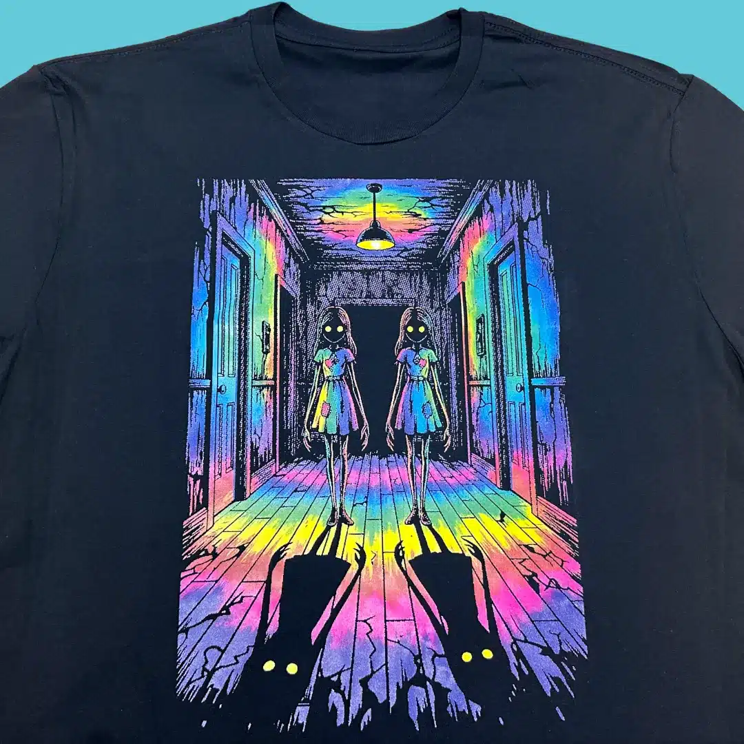
Because those dots are what make prints softer, more breathable, and more flexible.
They solve the “heavy hand feel” problem you often get with large DTF transfers.
Without halftoning, your design might end up looking plasticky, stiff and… well, not quite professional.
Now, before you think we’ve just discovered the Holy Grail of printing, let’s slow down for a second. Halftoning has been around for decades, ever since the days of screen printing.
What’s new, however, is how DTF puts this old-school trick to work in a whole new way.
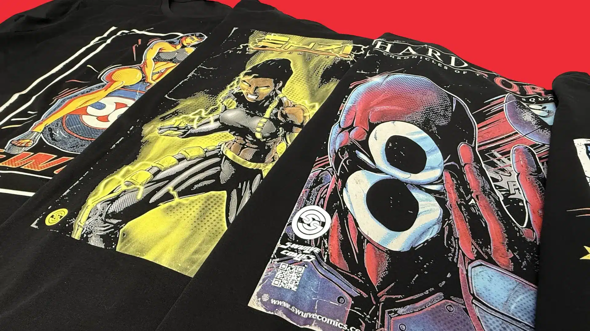
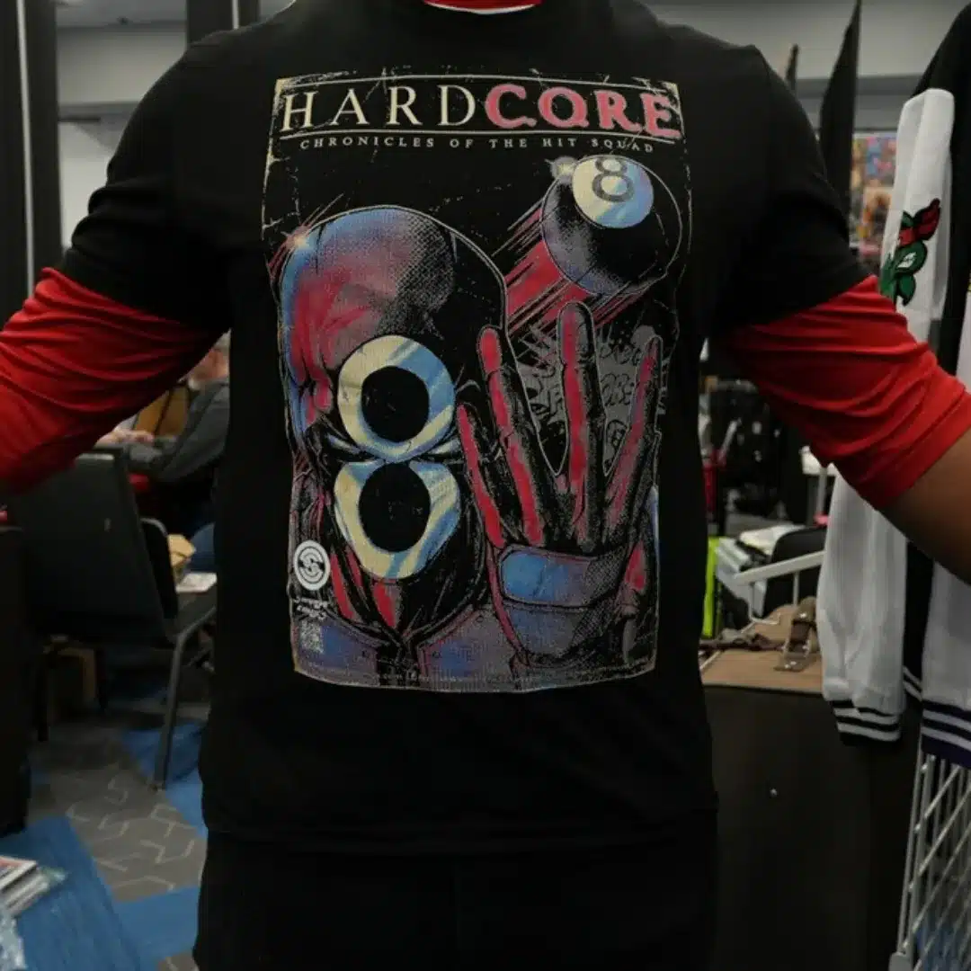
If you’ve ever looked closely at a newspaper photo or a comic book illustration, you’ve already seen halftoning in action.
Up close, it’s all dots. Step back, and your eyes seamlessly blend those dots together into smooth gradients, solid colors, and fully formed images.
DTF halftoning works the same way.
Instead of printing one thick, solid layer of ink, it breaks the artwork into tiny dots that visually read as a complete image.
You still get the look of a full print and sharp detail, but with less ink buildup on the garment or weight that usually comes with it.
And as a bonus, halftoning delivers a few indirect perks as well: reduced ink usage, faster production times, and more efficient printing overall.
And that’s just the beginning. Next, we’ll take a closer look at the points we just covered to see why they matter.
“It’s like pixelating on purpose—smarter dots that build better-looking images.”
Why Halftoning Matters for DTF Printing
If you’ve been following along, you should already know what halftoning is and why it matters for your next prints.
With that foundation in place, let’s take a closer look at why halftoning matters for DTF printing.
When done right, it:
- Avoids heavy ink loads: Halftoning spreads the color in tiny dots instead of solid blocks or areas, preventing oversaturation on the transfer film or substrate. This reduces bleeding, blobbing, smudging, and curing issues.
- Keeps detail: Proper halftoning preserves fine lines, gradients, and text by controlling dot placement and size. This ensures sharp image reproduction, even on small or complex designs.
- Prints feel better: By reducing the amount of deposited ink, halftoning results in a thinner ink layer. This gives the final print a softer hand and more natural feel on the fabric.
- Boosts speed: Lighter ink coverage dries faster, and your printer spends less time laying down heavy layers. That means more transfers (and finished products) per hour without extra effort.
- Potentially lower print costs: Using fewer grams of ink per print adds up fast. You save on expensive DTF ink without sacrificing quality.
- Better Washability & Durability: Thin, evenly distributed ink sticks better and cracks less over time. Your designs last longer through repeated washing.
We could go on all day with this list… but really, what does this mean for you?
It means fewer ruined transfers, sharper designs, softer prints, faster output, and less money wasted on ink.
In short, halftoning fixes a lot of problems DTF printers struggle with most.
Your prints not only look better but they last longer, feel better, and sell faster.
Honestly… what more could you ask for?
Not much, really.
That’s the what and why. Next, we’ll get practical and show you exactly how to do it.
“Halftoning turns your RIP from a basic print button into a real tool.”
How to Set Up Halftoning for DTF Prints
Enough theory.
At this point, you know what halftoning is and why it matters and how it makes your DTF prints look better, feel better, and last longer than they would otherwise.
That’s the important part.
Now comes the part where most people usually get stuck: the settings, the numbers, the knobs and options that seem like they were named by a software engineer just to confuse you.
The good news?
It’s not as complicated as it sounds. Once you get the hang of it, it’s kind of relaxing and enjoyable.
The first thing you want to do is make sure your printer is ready. Inks loaded, transfers in place, everything nice and set up.
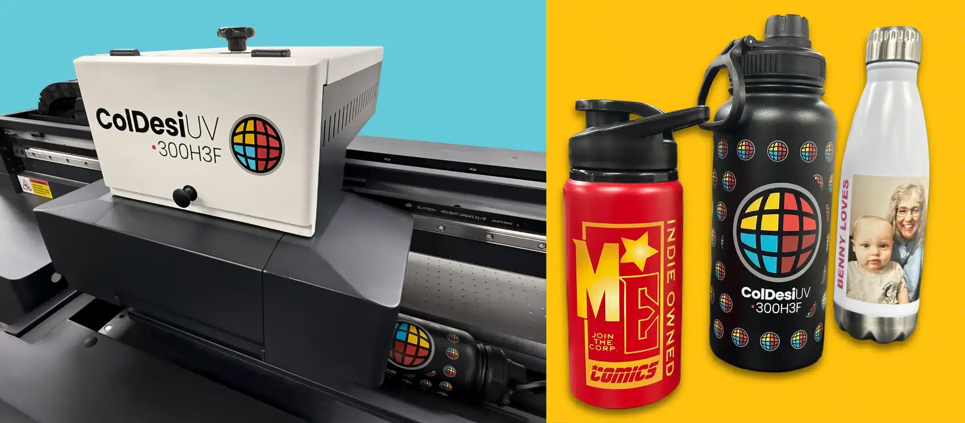
Next, make sure you have ColDesi RIP installed. That’s the software we’ll use for halftoning in this guide.
And of course, you’ll need a design to work with. Without it, there’s nothing to print.
Once you have these basics ready, halftoning your graphics is mostly a matter of following these steps:
ColDesi RIP Setup
Step 1: Import Artwork
File → Import Image / Add Job. Use PNG, TIFF, or flattened PSD at 300 DPI.
Step 2: Confirm Job Setup
Verify printer model, film size, and print resolution in Job Properties.
Step 3: Locate Screening Controls
Print Settings → Advanced Settings → Screening / Halftone Controls.
Step 4: Choose Halftone Mode
Recommended: Hybrid or FM Screening for apparel gradients.
Step 5: Adjust Dot Frequency (LPI)
Start at 40 LPI. Vintage: 25–35. Standard: 35–45. Photo: 45–55.
Step 6: Screen White Ink Separately
White Layer Settings → White Screening. Suggested White LPI: 30–40.
Step 7: Apply Ink Limiting
Color ink limit: 90–95%.
White ink limit: 85–90% to prevent dot fill-in.
Step 8: Preview Output
Use Preview/Raster View.
Zoom into gradients to confirm dot clarity.
Step 9: Save Presets
Save your halftone settings as named presets for repeatable production.
Step 10: Print and Test Cure
Always test print, powder, cure, and press to verify dot clarity and durability.
Recommended Starting Settings Screening:
Hybrid/FM | Color LPI: 40–45 | White LPI: 30–40 | Dot Shape: Round
There you have it.
Just like we promised, it’s not nearly as hard as you might have thought.
Most of the halftone settings are already built right into the software. You just tweak a few things here and there and you’re ready to print.
But don’t get too comfortable just yet. Even a small mistake can ruin a print (and all your hard work).
In the next section we’ll go over the most common mistakes people make, even when they think they’re doing everything right and following all the steps perfectly.
Tip: “Don’t blindly trust presets. Print a grayscale ramp and tweak from there.”
Common Mistakes to Avoid
You’ve read the articles, gone through forum threads, watched a few videos, and tweaked the settings as closely as you could to match the instructions.
And yet… here you are.
Staring at a print that looks nothing like it did on your screen.
If you haven’t been there yet, consider this a warning for later.
If you’re lucky, all you lost was some film, ink, and time.
At worst, you also ruined a garment. Maybe two. Maybe a whole run before you caught it.
By then, the damage is already done.
The good news? This happens to every DTF printer.
One overlooked detail, setting, or one innocent looking checkbox can undo everything that came before it.
In most cases, the cause is painfully ordinary:
- Using photos without prepping for halftone
Photos need contrast adjusted, noise cleaned up, and resizing done before halftoning. If photos are left as-is dots may merge or collapse into the same density. There needs to be clear separation between highlights, midtones, and shadows. - Applying halftones in Photoshop and RIP—double trouble
Halftoning in both Photoshop and the RIP can distort dot patterns, muddle tones, and reduce detail. To get clean, accurate prints, apply halftones in only one software, either in Photoshop or in the RIP, but not both. - Ignoring dot gain (ink spreads more than expected on film)
Dot gain occurs when printed ink spreads beyond its intended size, making halftone dots larger, darker, and more saturated than designed. To compensate, adjust your halftone size, screen frequency, or RIP settings to account for the spread. - Same settings for light and dark garments—big mistake
Using identical print settings for light and dark garments can lead to unexpected results. Always adjust settings based on garment color.
Best Practices by Use Case
|
Use Case
|
Halftone Tips
|
|---|---|
|
Photo-heavy designs |
Use round dots, higher LPI |
|
Bold graphics/textures |
Lower LPI, elliptical or line dots |
|
Light garments |
Less ink, tighter dots |
|
Dark garments |
Test dot gain—adjust accordingly |
While this isn’t an exhaustive list, we offer it as a start.
Do these right, and the rest practically takes care of itself. Especially when paired with one of our ColDesi direct-to-film printers
Your prints will look better, you’ll waste less, and your clients will walk away happy.
So what’s left to say? Not much.
We’ve gone over a lot already without overwhelming you. Most of the important stuff is already in your hands.
Now let’s tie it all together in the final thoughts.
Wrapping It All Up: Our Final Thoughts
Here we are.
You’ve made your way through quite a bit of content—and hopefully, you’ve also watched the accompanying video clips and explored the supplementary how-to articles and guides we linked.
If you’re short on time or haven’t gotten to it all yet, the main takeaways from today can be summed up in just a few sentences.
In its simplest form, halftoning is the process of converting your image, graphic, or artwork into tiny dots or other shapes that vary in size or spacing.
When printed, your eyes seamlessly blend these dots together into smooth gradients, shadows, and solid colors that visually read as a complete image even though the printer is actually laying down a series of individual dots.
And it works like this: you import your photo into the RIP software and use its built-in settings to break that image into tiny dots that the printer can actually lay down.
The software takes your image, analyzes it, and converts everything into a dot pattern. You tweak density, angle, dot size, and maybe the shape itself until it looks the way you want it to.
And just like that, your image is ready to print.
We have to admit, something that we thought would be complicated actually turns out to be surprisingly straightforward and simple.
And it’s amazing to see all those tiny dots come together to form a full image.
We hope you walked away with at least a small piece of useful information, a little “aha” moment, or that we cleared up any questions you had along the way.
If you did, then we did our job right.
That’s all for now. Thank you for reading.